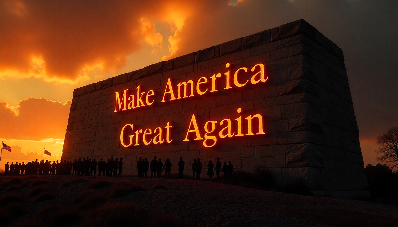
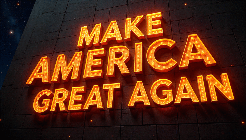
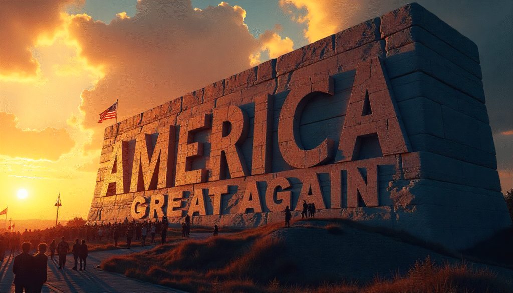
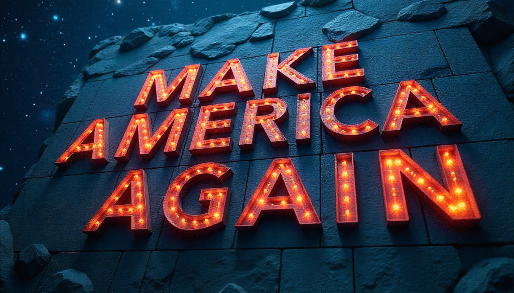
The phrase ( Make America Great Again font ) refers to the typographic style used in the MAGA slogan branding.
This style has become instantly recognizable, not just because of the message, but also because of its visual presence.
The font style combines boldness, heritage cues, and high visibility. Although there is no single definitive, commercially available typeface called “the MAGA font” What is used in signs, hats, and promotional materials often resembles or blends popular serif fonts like Century Schoolbook and sometimes Times New Roman, but modified for strong impact.
Designer choices such as uppercase lettering, thick stroke weight, and very visible contrast give this font style its authority.
On the red hats, hite bold serif letters stand out sharply. These choices ensure readability at distance, recognition under many lighting/printing conditions, and memorability.
Why Designers Study and Replicate the MAGA Font
Designers often study and replicate the Make America Great Again font because it is more than just text on a cap it represents a bold, recognizable style that successfully captured global attention.
The clean all-caps serif typeface delivers a sense of authority and confidence, while its simple arrangement makes it instantly memorable.
By analyzing this design, creators learn how typography can strengthen a message, spark emotional reactions, and build a lasting identity.
Some designers replicate the font in their own projects to explore how political or cultural branding works, while others use it as a case study in visual communication, showing how something as basic as font choice can shape movements, campaigns, and even history.
Key Design Traits of MAGA Font Style
Below is a table summarizing the most important properties of the Make America Great Again font style.
| Property | Description / Effect |
| Serif style | The letters are often serifed; this gives the font a traditional, formal feel. |
| All-caps presentation | Uses uppercase letters throughout to convey strength and assertiveness. |
| Bold weight | Thick strokes help with visibility and impact, especially on merchandise like caps or signs. |
| High contrast (red/white) | Red background with white text or similar color contrast makes the font vivid and attention grabbing. |
| Letterform modifications | Small quirks like mismatched Gs, high crossbars on “A”, subtle misalignments in E or R. |
| Limited kerning And spacing quirks | Some letters are spaced loosely or tightly; this adds to the character but reduces typographic “perfection”. |
Differences Between MAGA Font And Similar Fonts
Many people have tried to pin down which existing fonts come closest to the famous maga design, and while there is not a single exact match, several typefaces are frequently mentioned.
Century Schoolbook is often cited as the closest match, especially for the serif style used in the word “America” on many versions of the slogan.
Others suggest times new roman, though this option usually comes from casual observers or non-design professionals.
In reality, times new roman often does not line up perfectly with the embroidery seen on hats, since those letterforms were slightly modified.
Some designers experimenting with unofficial graphics or parody versions turn to fonts like bookman old style, baskerville, or palatino, which share a similar serif feel and traditional character.
On the other hand, bolder fonts such as Impact or helvetica bold have occasionally been compared because of their visual weight, but they lack the serif detailing and heritage-like impression that make the maga font distinctive.
Positive Branding Lessons from the MAGA Font
One of the biggest lessons designers and marketers can take from the maga font is how a clear and consistent visual style can create unforgettable branding.
The font works because it is bold, legible, and timeless, allowing the message to be read instantly from a distance.
Its traditional serif look gives a sense of authority and trust, while the repetition across hats, posters, and digital media reinforced recognition everywhere.
The takeaway for brands is that typography is not just decoration it can become the heart of a movement or identity.
By choosing a font that matches the tone of their message and using it consistently, businesses and creators can build the same kind of strong, lasting impact that the MAGA design achieved.
Design and Usage Tips for Makers
For anyone who wants to design with the MAGA font style or replicate its look for parody, education, or other non-political uses there are a few simple guidelines to follow.
Always start with bold, all-uppercase serif letters, since that is what gives the design its strong and commanding presence.
Keep the strokes thick and avoid delicate letterforms, which can weaken the impact. Pay close attention to letter spacing, especially in pairs like “AT,” “ER,” or “IC,” where small gaps can look uneven if not adjusted manually.
Color also matters: the most iconic pairing is red with white text, but any high-contrast combination will ensure readability and instant visibility.
For physical products like embroidered hats or merchandise, it is important that the serifs and strokes are wide enough so details do not disappear in stitching.
And finally, if you are considering using the slogan itself in your design, make sure to check the trademark status and permissions particularly if the project has a commercial purpose.
Final Thoughts
Make america great again font style is more than just typography it is an identity. Its design choices, though sometimes imperfect (kerning issues, mismatched letter details), reinforce strength, tradition, visibility. Whether you see it positively or critically, its visual power is real.
Designers looking to understand it should consider both the technical form (serifs, boldness, spacing) and the cultural load carried by the type.
When replicating or adapting it, balancing homage with ethical or legal clarity helps make sure your work is strong and responsible.
FAQs
What exactly is the Make America Great Again font style?
A bold serif look, usually uppercase, with strong contrast, often similar to Century Schoolbook or Times New Roman variants.
Is there a specific font officially named “MAGA font”?
The style is custom or modified rather than one trademarked typeface.
Can I legally use the Make america great again font slogan and font style?
Using just the font style is okay, using the slogan itself may require permission due to trademark.
What fonts replicate the MAGA font for design work?
Century Schoolbook, Bookman Old Style, Baskerville, Palatino are among commonly used alternatives.
Why are there letter inconsistencies in MAGA hat designs?
Embroidery and manufacturing cause design trade-offs; some letters like “G” differ due to production constraints.
What color scheme is tied to the MAGA font style?
Red background with white bold serif text is the dominant combo; very high contrast helps visibility.
Where is the MAGA font style most effective?
On signage, caps, merchandise, campaign visuals, social media graphics anywhere large, visible, quick recognition matters.
What makes people criticize this font style?
Because it is inseparable from political messaging, many view the typography as partisan or polarizing; also design imperfections are sometimes highlighted.

 By
By
 By
By
 By
By

 By
By