
The term preppy fonts refers to a distinctive style of typography that effortlessly blends classic elegance with a clean playful charm. This fonts are a popular style for designers who want a clean bold and bright look in their projects. Many people use this fonts for logos social posts covers and other creative work because this style gives a soft elegant and fun feel.
The article explains what preppy fonts are and why they are popular in design. It covers different types like serif sans serif script and display their uses in branding logos invitations and social media. It also gives tips on choosing the right preppy font for any project.
What Are Preppy Fonts

The term preppy fonts describes a unique kind of lettering that perfectly mixes classic style with a clean playful charm. These typefaces are the foundation of a timeless brand aesthetic giving designs a sophisticated feel without being too formal or stuffy.
The look of preppy style typography comes from preparatory school fashion and coastal leisure culture creating a polished appearance.
When you choose a this font you are selecting a visual language that suggests tradition quality and a sense of laid back luxury appealing to a high end but approachable audience for all your design projects.
Why Preppy Typography Is So Popular
Preppy fonts are popular because they are clean simple and easy to read. They combine classic style with playful details like rounded edges or bold serifs. This balance gives a neat and elegant look while keeping designs fun and approachable.
Designers use preppy typography in logos invitations covers and social media because it works well in both vintage and modern layouts. It also fits cute bold or retro designs making it a versatile choice for many projects.
Types of Preppy Fonts You Can Use
Preppy fonts come in different styles to suit any design. Explore these types.
Preppy Serif Fonts for Timeless Elegance
Preppy serif fonts feature small decorative strokes called feet at the ends of the letters giving them a classic and authoritative look. These fonts show timeless elegance making them ideal for important brand items like logos and main headlines.
They easily communicate a sense of trustworthiness and high quality perfect for any design that needs to look polished and expensive. The bold but gracefully curved style of these serifs adds a beautiful touch of visual class.
Preppy Sans Serif Fonts for Modern Chic
Preppy sans serif fonts are letters that do not have the small decorative feet or strokes found at the ends. This design gives them a sleek modern and very clean appearance. To make them preppy designers often give them slightly rounded edges or ensure the lines have a balanced thickness which stops the font from looking too plain or severe.
These simple fonts are great for body text and websites because their main goal is perfect clarity and readability. They convey a look that is both confident and sophisticated.
Preppy Script Fonts for Adding Personal Charm
Preppy Script Fonts are typefaces that resemble elegant handwriting with flowing connected strokes. They are perfect for injecting personality and charm into a design making it feel unique and handmade.
Because of their personal and friendly style they are a top choice for invitations greeting cards social media accents or any creative design where a touch of elegance is needed. The intentional use of a script font ensures the project maintains a sophisticated yet highly relatable flair without losing its stylish appeal.
Preppy Display Fonts for Catching the Eye
Preppy Display Fonts are specifically crafted to be the main visual focus of any project designed to attract immediate attention.
These fonts are characterized by their bold shapes unique flair or slightly oversized look making them perfect for major headings posters or any energetic youth focused designs. Their primary job is to ensure that the most important text stands out instantly giving a dynamic and youthful energy to the entire visual project.
Optimizing Preppy Fonts for Digital Use

When using preppy fonts for websites and digital media the Gimkit host must prioritize technical performance alongside aesthetic appeal. Overly heavy or decorative fonts can slow down page load times which harms the user experience and negatively impacts search ranking.
It is best practice to use simpler web optimized fonts like those from Google Fonts for all body text while limiting custom or highly stylized fonts to titles and headings. This balance ensures the timeless brand aesthetic is maintained without sacrificing necessary website speed.
How to Choose the Right Preppy Font
The best way to pick a preppy typeface is to first understand the mood of your project. If you want a classic look then choose serif typefaces. If you want a fresh and clean feel then choose sans serif.
If your design needs a soft and friendly style then script typefaces are the best choice. Preppy display fonts help you build a bright and bold message. It is also good to check readability because each preppy font family offers different shapes contrast and weight.
Ensuring Preppy Fonts Readability Across All Devices
The preppy style fonts chosen for a project must be thoroughly tested across a wide range of screen sizes from large desktop monitors to small mobile phones. What looks beautiful on a designer’s screen might become illegible on a small device especially with thin script or cursive styles.
The designer must confirm that the preppy fonts maintain their integrity and readability on all platforms ensuring a consistent and pleasant user experience for the entire audience. This cross platform testing is critical for modern design success.
Preppy Fonts vs Other Popular Styles
Preppy fonts stand out because they blend classic structure with a hint of playful charm avoiding extremes. They differ sharply from Minimalist fonts which are very geometric stark and cold focusing only on function with zero decoration. They are also opposite to Bohemian fonts which are often rough hand drawn or highly erratic aiming for a free spirited or organic look.
Finally preppy style is much softer than Gothic fonts which are dense dark and overly formal designed only for heavy tradition or historical contexts. The preppy style always finds the middle ground prioritizing a polished approachable aesthetic that is both clean and friendly.
Avoiding Common Typography Mistakes with Preppy Fonts
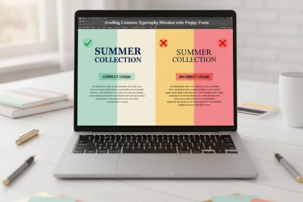
A significant mistake is using decorative preppy fonts for long paragraphs of text which severely hinders readability. These stylized fonts should be restricted to headlines accents or short phrases to maximize their impact.
Furthermore poor letter spacing also known as kerning can ruin an otherwise perfect font choice making the text look cramped or unbalanced. Careful adjustment of the space between letters is necessary to ensure every design is polished and professional.
Conclusion
Mastering the use of preppy fonts is the best way to create designs that look both stylish and truly timeless brand aesthetic. By clearly understanding how preppy serif fonts differ from preppy sans serif fonts and using them wisely for logos main titles and regular text designers build a strong unified look.
These typefaces give the perfect mix of classic structure and a modern friendly feel ensuring your brand speaks of high quality reliability and simple elegance. Choosing this style of typography guarantees your design stays fresh yet classic appealing across all types of media.
FAQs
What is the best type of preppy font for a primary logo?
The most effective preppy fonts for a primary logo are usually bold serifs or clean high contrast sans serifs. These choices offer the best blend of classic elegance and visual strength ensuring the logo is memorable.
Should I use a script font for all my body text?
No using a handwritten preppy cursive font for body text is generally a poor design practice. Script fonts are best limited to short headlines accents or signatures to maintain readability and avoid clutter in the design.
How many preppy fonts should be used in one design?
The best practice for a unified design is to use only two or three complementary preppy fonts. This usually involves one primary display font and one simple secondary font for all the body text and supporting information.
What are the best colors for preppy font style?
The best colors for preppy fonts are soft bright pastels and warm tones. These colors match the clean youthful and stylish look of preppy typography.
What is a good free alternative to a preppy font?
Many high quality fonts on platforms like Google Fonts offer a similar clean and structured look. Searching for classic sans serifs like Montserrat or serifs like Playfair Display can provide excellent free alternatives.
Where can I buy high quality preppy font files?
You can buy high quality preppy fonts from reputable online marketplaces such as Creative Market or Fontspring. These sites ensure you receive the correct licensing for commercial use in your design work.

 By
By
 By
By

 By
By
 By
By