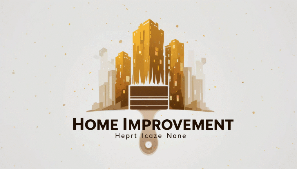
When you think of a strong home improvement business one of the first things that comes to mind is its logo.
A home improvement logo is not just an image or text it is the face of your brand. It communicates reliability, professionalism, and the kind of work you deliver. In a highly competitive industry a thoughtful logo design can make your company memorable and trustworthy.
This guide takes you through everything you need to know about designing the right home improvement logo from choosing colors and fonts to avoiding common mistakes.
Why a Home Improvement Logo Is Essential
Your logo is the base of your brand’s look and feel. It creates a first impression within seconds helping people decide if they can trust you.
A clear and consistent design also makes your business easier to remember. When your logo looks professional it shows customers you take your work seriously and sets you apart from less experienced competitors.
Plus, it ties all your marketing together from business cards and websites to trucks and uniforms so your brand always looks strong and reliable.
Elements That Make a Great Home Improvement Logo
The best home improvement logos are built on a few key design choices. Each element color, font, icons, and simplicity plays a role in shaping how people see your business.
Colors that reflect your values:
Colors have the power to influence emotions. Blue is often linked with dependability and trust while green highlights eco-friendly values and growth.
Gray or black gives a sense of strength and professionalism. On the other hand, orange and yellow bring energy, creativity, and a welcoming feel. Picking the right color sets the tone for your entire brand.
Fonts that speak for your brand:
The type of font you choose says a lot about your company. Bold, heavy fonts show strength and reliability which works well for contractors and builders.
Clean and modern fonts are better suited for design focused businesses like remodeling or interior improvements.
Icons and shapes that communicate:
Adding an icon can make your logo more memorable. Common choices in the home improvement world include houses, rooftops, and tools such as hammers or saws.
You could also use doors, windows, or paintbrushes to highlight specific services. For a modern twist, abstract shapes can represent innovation and growth without being too literal.
Keep it simple:
The most effective logos are not overly complicated. A clean simple design is easier for people to recognize, remember, and trust. It also ensures your logo looks good everywhere from a small business card to a large truck wrap.
Styles of Home Improvement Logos
When it comes to designing a home improvement logo, there are a few common styles you can choose from, each with its own strengths.
Wordmark logos:
Focus only on your business name, using a unique font or custom typography to stand out. This style is especially helpful for new businesses that want people to remember their name right away.
Combination logos:
Mix both text and an icon. This is the most popular option in the home improvement industry because it quickly shows what type of work you do while still keeping your business name front and center.
Emblem logos:
Place your business name inside a shape, like a shield, badge, or circle. This style feels more traditional and professional making it a great choice for long standing companies or family run businesses that want to show history and trustworthiness.
Tips for Creating a Strong Home Improvement Logo
- Stay timeless: Avoid designs that may look outdated in a few years.
- Ensure scalability: It must look good on business cards and truck wraps.
- Limit colors: Stick to 2 to 3 colors for simplicity.
- Get feedback: Test your design with clients or friends.
- Work with a designer: Professionals can make your vision stand out.
Practical Inspiration for Home Improvement Logos
If you are looking for inspiration there are plenty of creative ways to design a home improvement logo that fits your business personality.
One simple idea is to use a roofline placed above your company name which instantly signals that you are connected to housing or construction.
Another option is to integrate tools such as a hammer or saw directly into the text making your logo both unique and descriptive.
Minimalist house shapes with clean, simple lines are also very popular especially if you want a modern and sleek look that’s easy to recognize.
For businesses that focus on eco-friendly improvements, adding natural elements like leaves or greenery can highlight your commitment to sustainability.
Where to Use Your Logo Effectively
Your home improvement logo should be visible everywhere:
- Business cards and flyers
- Website and social media
- Company uniforms and hats
- Vehicle wraps and signage
- Brochures and invoices
The more consistent your logo placement, the stronger your brand identity.
Mistakes to Avoid When Designing a Home Improvement Logo
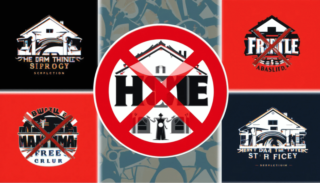
- Using too many fonts or colors.
- Copying competitors instead of creating something unique.
- Adding too much detail that doesn’t scale well.
- Ignoring how the design looks in black and white.
- Following trends that fade quickly.
Final Thoughts
A home improvement logo is more than decoration it is the heart of your brand identity.
It builds trust makes your business memorable, and shows clients that you are serious about quality.
Whether you are starting fresh or refreshing your look take time to create a logo that reflects your business values. A strong logo is an investment in your future success.
Related Topics:
Lowe’s Home Improvement Rancho Cucamonga CA
Maryland Home Improvement Commission
FAQs
Why do I need a home improvement logo?
It builds trust and makes your business more recognizable.
What colors work best for a home improvement logo?
Blue, green, and gray show trust, growth, and professionalism.
Can I design my own logo?
But a designer can give you a polished, unique result.
Should my logo include tools?
It can, but clean designs without tools also work well.
How much does a logo design cost?
From under $100 for templates to $1,000 + for custom branding.
How do I keep my logo timeless?
Stick with simple designs and avoid overused trends.
Can I update my logo later?
Yes but keep changes small so customers still recognize you.
Where should I use my new logo first?
Start with your website, business cards, and social media.
 By
By

 By
By

 By
By